TEENAGE APOCALYPSE
Visual System & Identity, Packaging
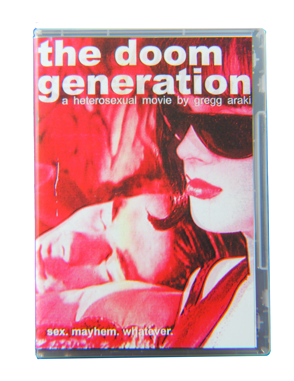
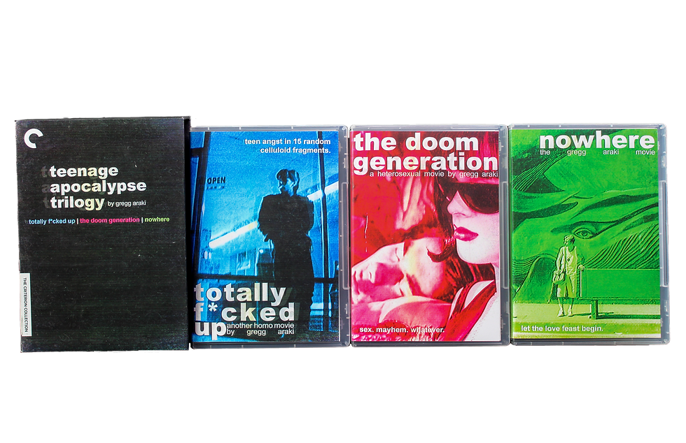
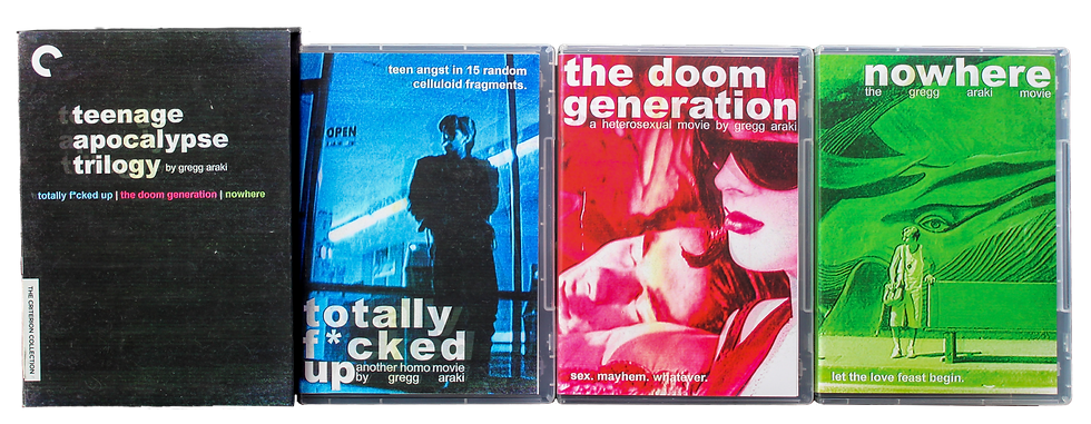
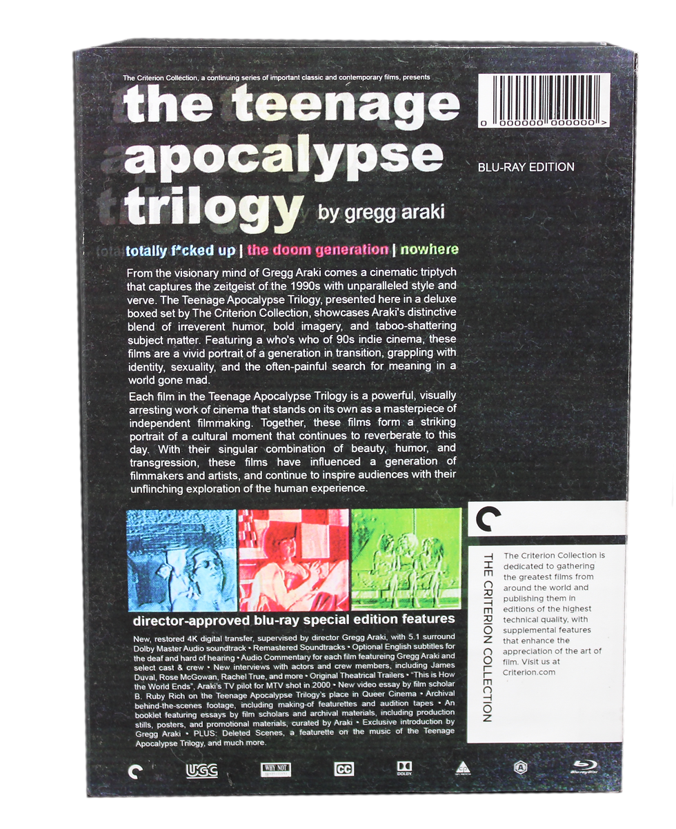
The Teenage Apocalypse Trilogy directed by Gregg Araki is a landmark series of films that captures the spirit of the 1990s with daring imagery, unconventional humor, and taboo-defying subject matter. With a talented cast of notable indie actors from the 90s, the trilogy presents a vivid and poignant portrait of a generation grappling with issues of identity, sexuality, and the search for meaning in a world that often feels chaotic and uncertain.
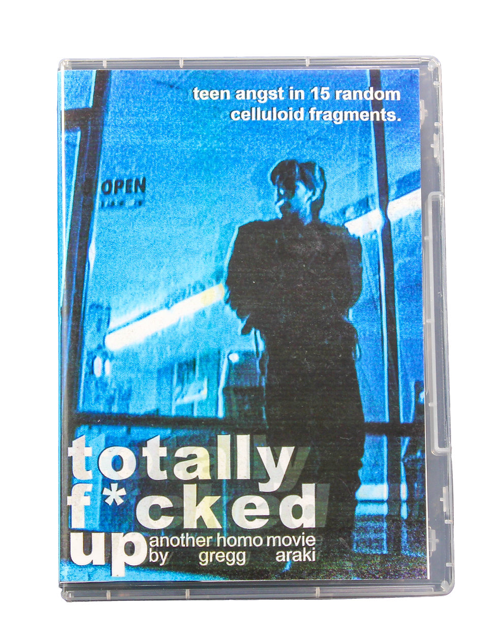
I am particularly drawn to these films because of their bold representation of queerness, which was a relatively rare and often stigmatized topic in mainstream cinema during the 1990s. However, despite their cultural significance, it is extremely challenging to access and watch these films (legally) within the US. This led me to conceive of a box set for the trilogy that pays homage to its unique style and impact, envisioning it as a hypothetical release from the Criterion Collection. The result is a compelling and visually striking package that captures the essence of these influential films, offering viewers a fresh perspective on a vital era of cinema and cultural history.
The Criterion Collection is a prestigious home video distribution company that specializes in releasing contemporary and classic films from around the world. Founded in 1984, Criterion has become known for their meticulous attention to detail, providing high-quality transfers, insightful bonus features, and unique packaging that highlights the artistry of each film. The collection is highly regarded among cinephiles and film enthusiasts for its commitment to preserving and celebrating the art of cinema.
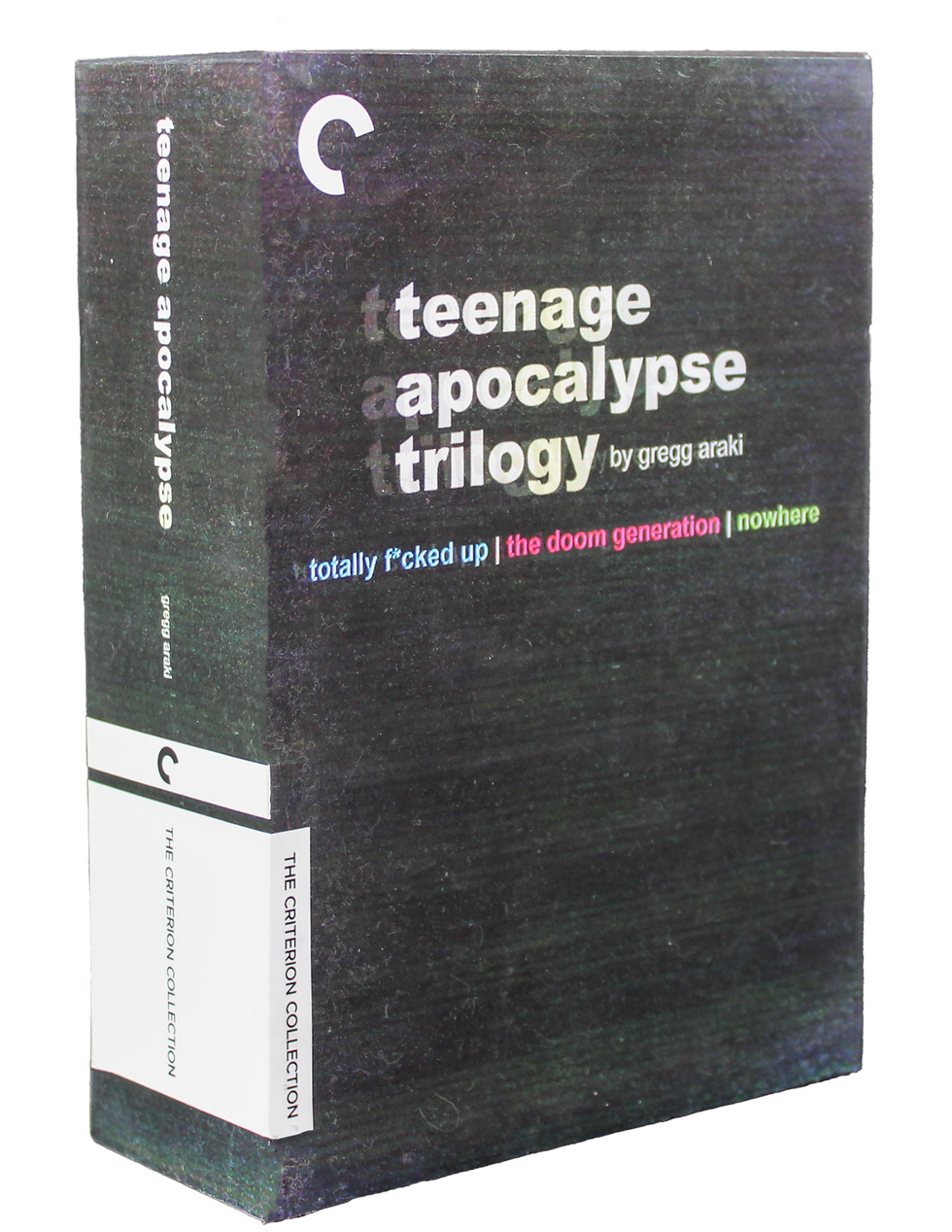
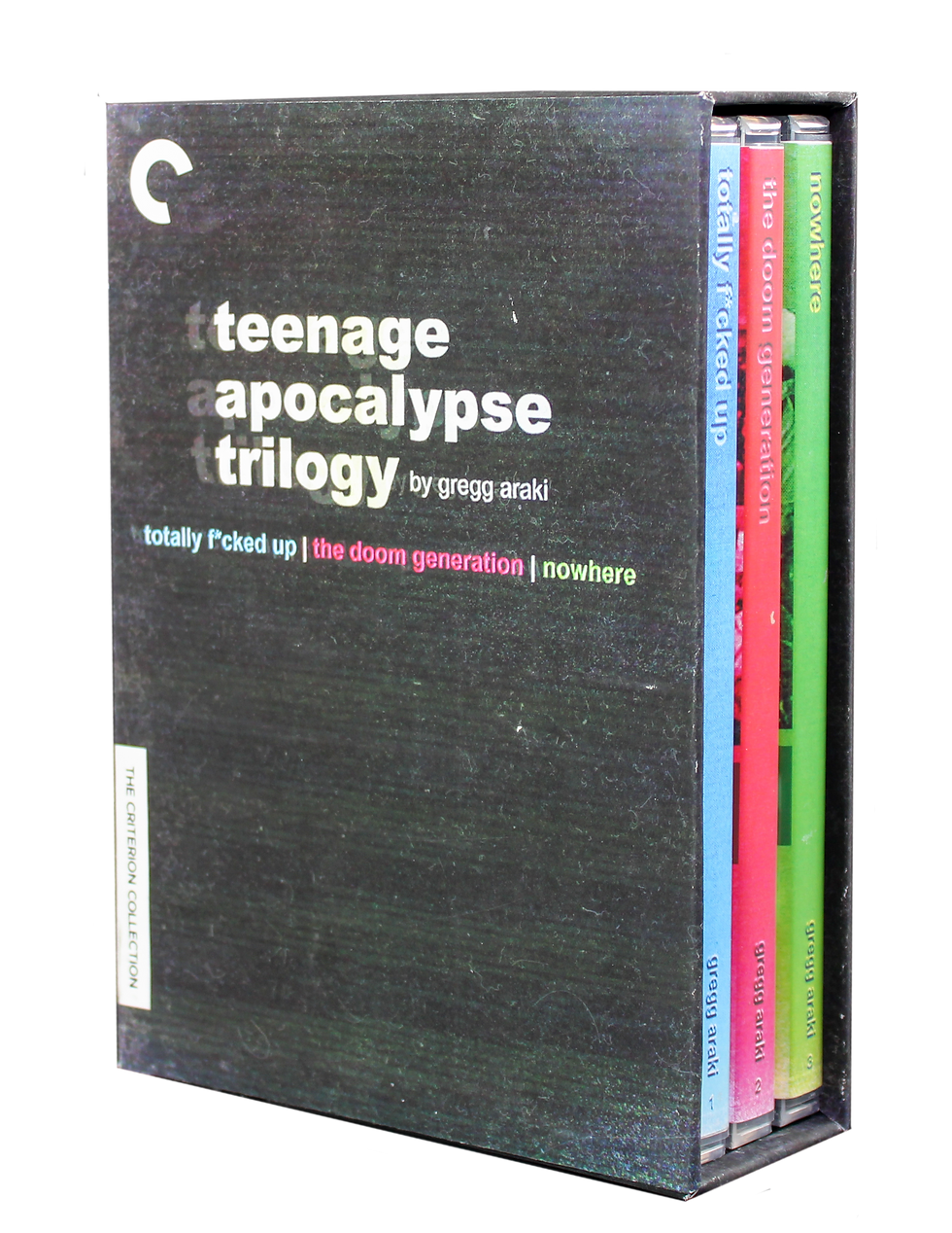
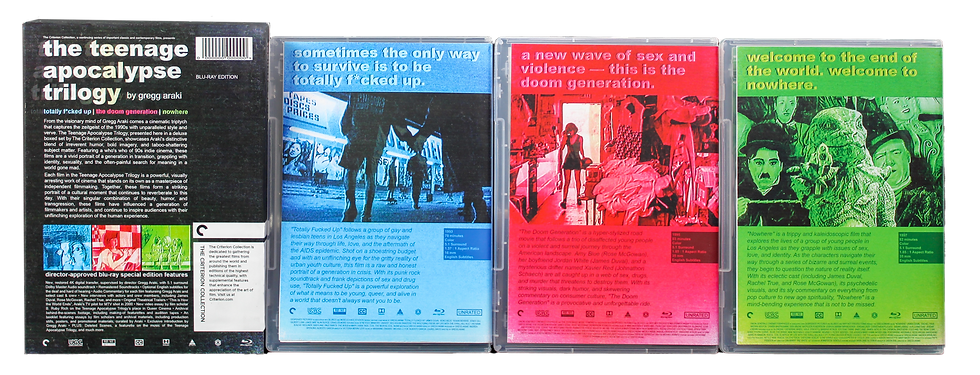
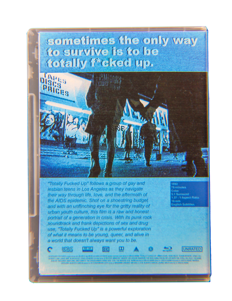
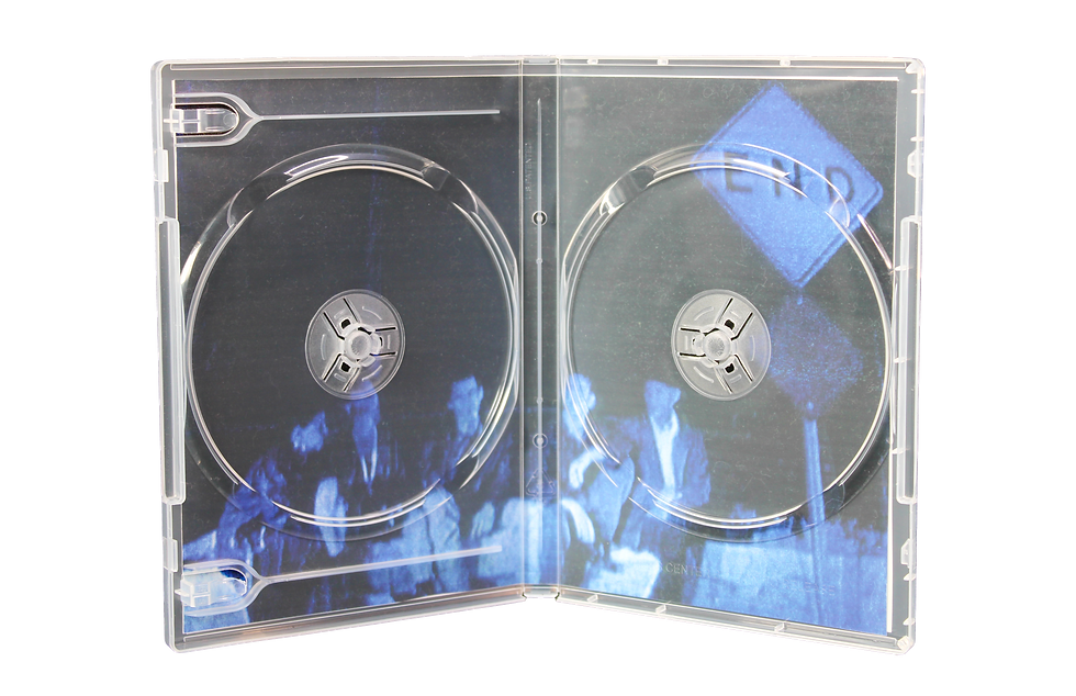
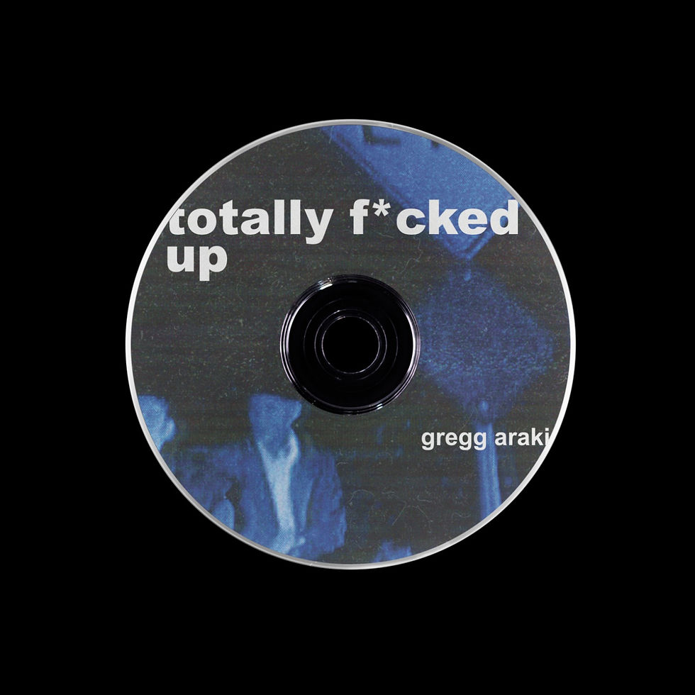
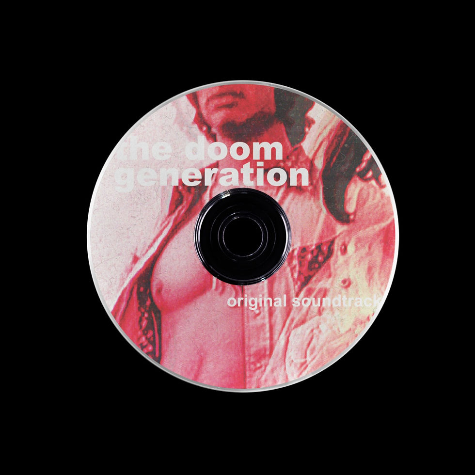
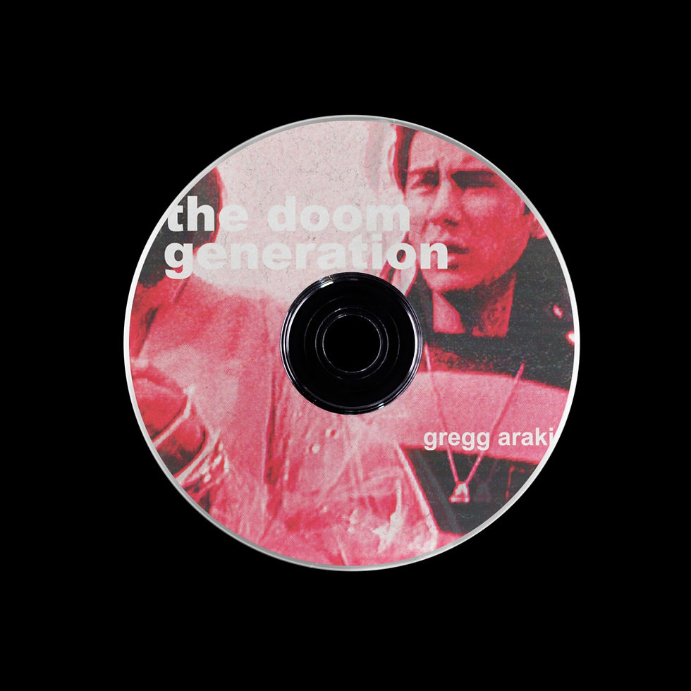
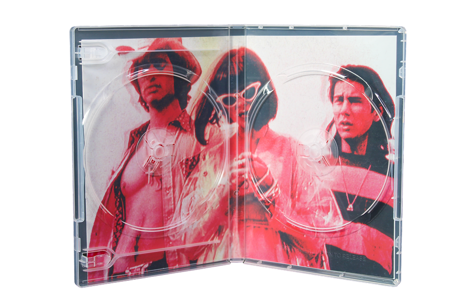
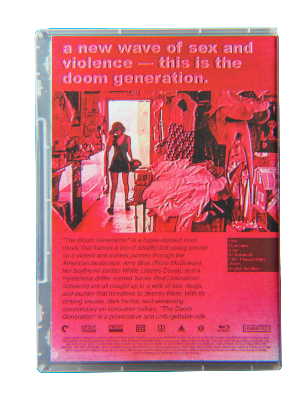
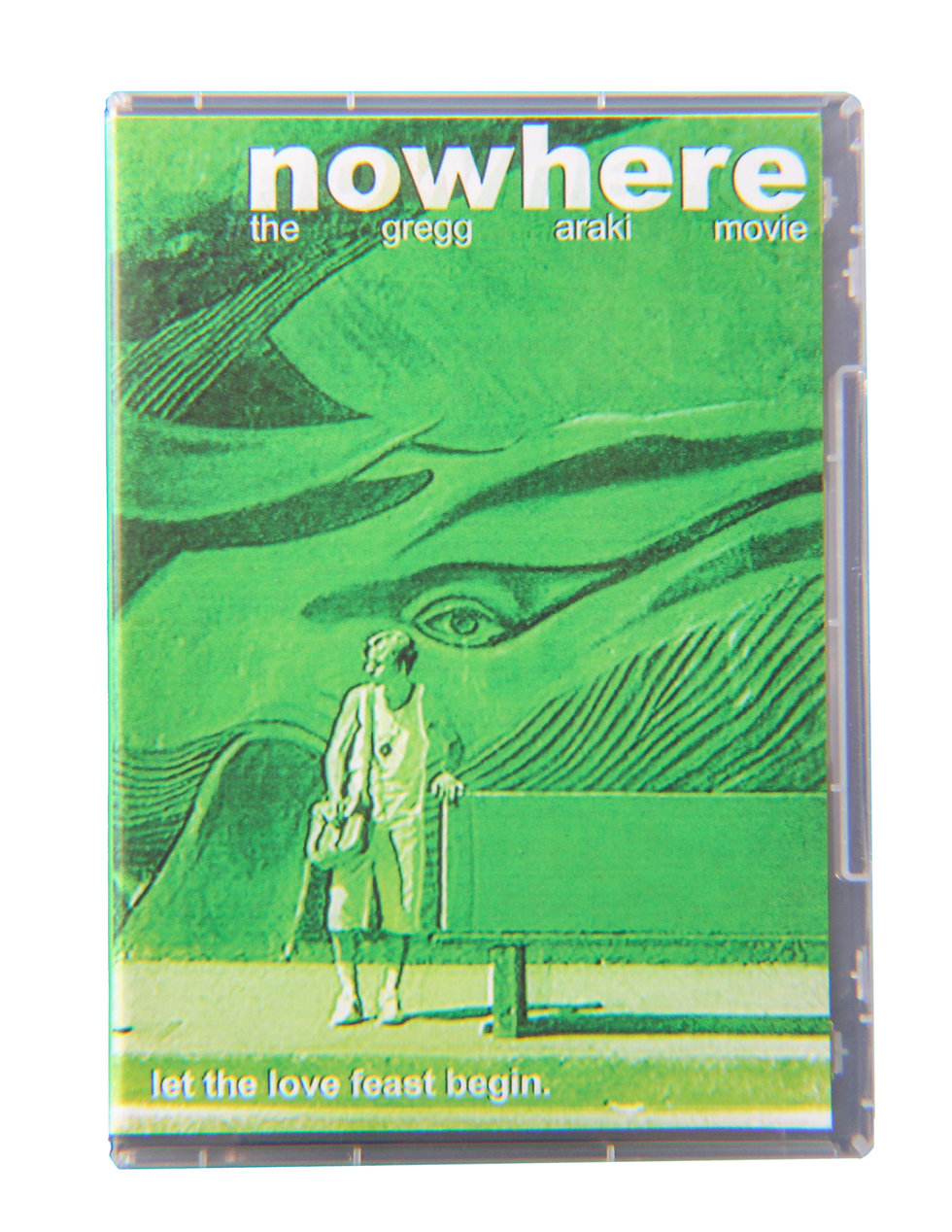
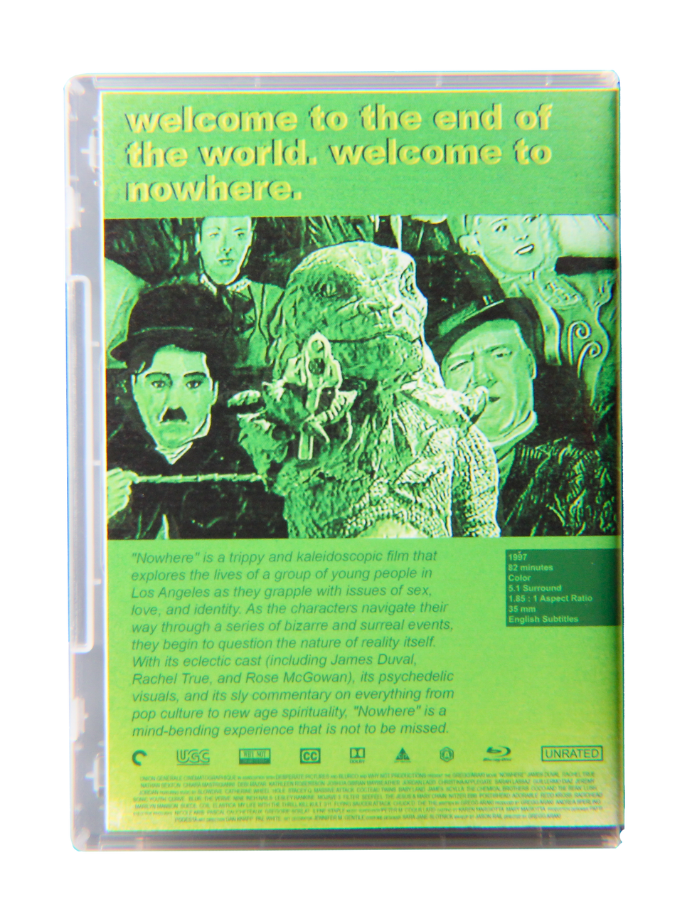
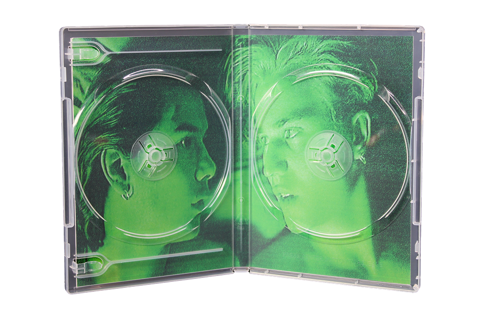
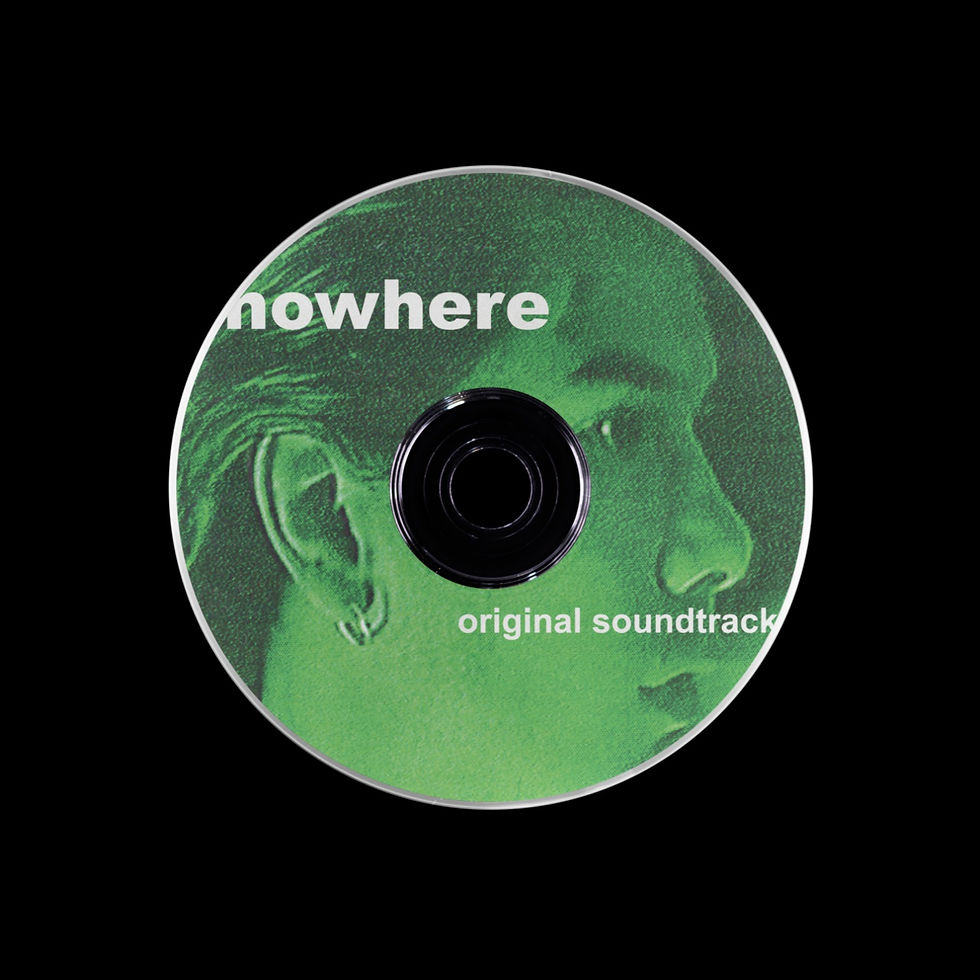
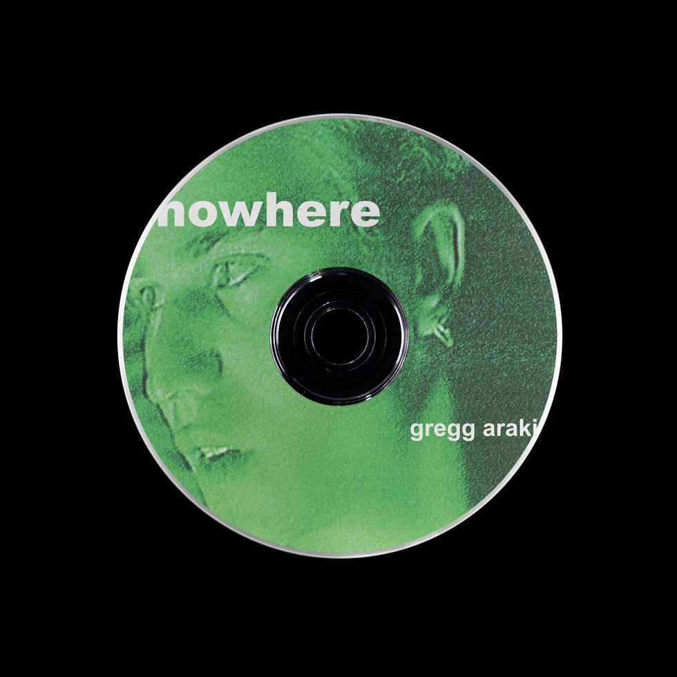
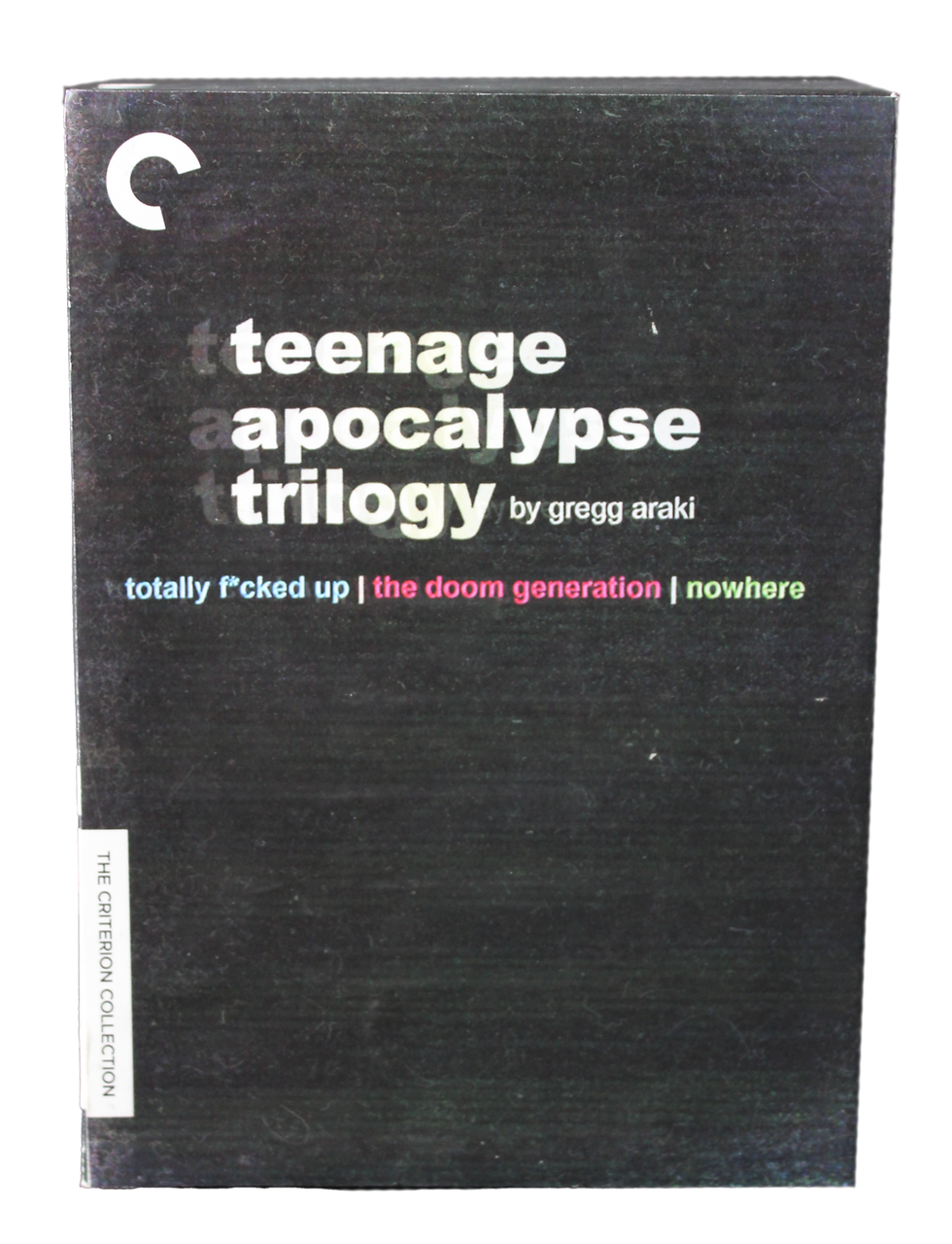
To create packaging that truly embodied the spirit of the Teenage Apocalypse Trilogy, I really dug deep into the style and tone of each film. I wanted the design to be more than just a simple reflection of the content, but also to pay homage to the time period when the films were made. To achieve this, I played around with different textures to replicate the signature VHS and CRT aesthetic that Araki is known for.
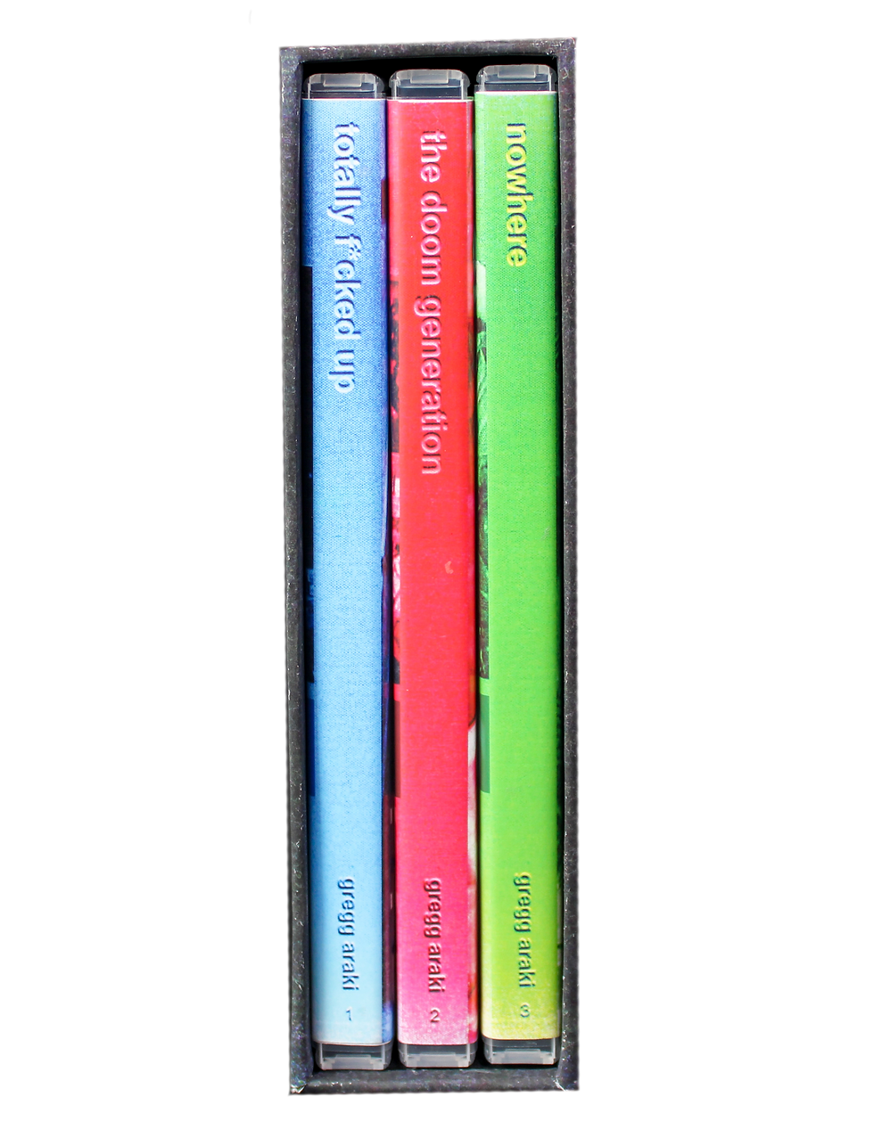
On top of that, I carefully picked out colors (Blue for Totally Fucked Up, Red for The Doom Generation, and Green for Nowhere) that matched the aesthetics & themes of each film in the trilogy. This ensured that the packaging not only served as a place to store and access the films, but also as a representation of the unique experience that each film offered.